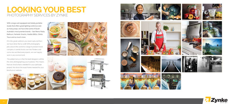
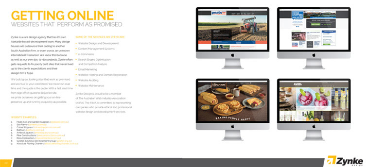
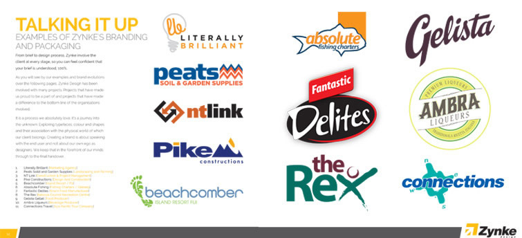
A little late with the June post, but we have good reasons, we’ve been really busy the last month. Seriously busy and it’s a good thing! Without the being busy we wouldn’t have jobs to do and we love working with our clients.
One of the major points we have had on our ‘to do’ list for the last few months has been updating our quoting template and a general tidy up of our internal communications. This comes down to (much like this very blog) – practicing what we recommend to our clients. Over the years our internal communications templates and general company-wide stationary had grown a bit stale, a bit of a hangover from long ago. With the history of Zynke Design stretching back over 20 years it’s inevitable that somethings date and just get a big bland, that doesn’t mean they have to stay that way though, and we’ve made the change.
With a growing list of jobs to quote and proposals to write we decided enough was enough and took the plunge, we dove in head-first and made it our mission to ensure the new quotes and proposals were going to look better than ever. After all, we’re a design agency and our materials should always look as good as what we create for our clients.
Our templates had been something we never really got around to changing when we changed most of our other bits and pieces (like our website… multiple times), and although the company kept evolving our quoting and proposal templates just became stagnant. I’m sure at one point in time they were fantastic, but with new technology and new times there are often better ways to do things, and being successful in business can often be about knowing when to make a change and step away from the tried and dated and moving on with something new, something better.
This situation really touches on a basic rule we really try to preach to our clients, branding and perception goes much deeper than just a logo: it extends right through a company and every thing has a role to play from the smallest tasks we perform as a business, like our quote and proposal templates to the larger, more visible things like our website. Keeping our old templates and old look really wasn’t communicating the message that we wanted to portray, as a brand to our clients. We really needed something with a bit more ‘oomph’ something that caught the attention and made people think we can do the job they want us to do. This got us thinking more about what we do want to show clients and new businesses when they communicate with us and that conversation is never a bad one to have internally.
The need to continually discuss and evaluate your brand is always something that should be occurring, it might already be but you just don’t consciously realise it. One of the most important conversations we often have with our clients is explaining to them that they really need to think beyond what ‘we do’ when it comes to their own brand. We can only offer so much of a visual look and style – much of what makes a brand what you want it to be are all of the little tasks. Eventually the little tasks build together to contribute to a larger impression of the whole company. This is extremely important after a re-brand or for a new small business to understand.

Your company is defined by how it is portrayed and how people perceive your business, if you want to appear professional to your clients, ensure every piece of communication you send them is in-turn professional – not just in the content, which you’re probably an expert in but also in the way things look (which is what we are experts in). Everything from the business cards you give away to prospective clients and new acquaintances to your website and everything in-between combine to build that narrative about what the identity of your company is. They help build an authenticity to what you say, and help to form impressions of what you are about – it makes so much sense to ensure that every piece of communication says exactly what you want it to say both figuratively and literally to help form that ‘big picture’ about your company.
Sometimes it might come down to something as simple as ensuring that everyone in your company uses the same fonts within your emails (we’ve seen some shocking and different emails come through from people at the same company) and sometimes it might mean going that extra mile and paying for a typeface to match your logo or identity which you can use for all of your word-processing and printed communications. There are a number of simple things that you can do to help ensure people are seeing you and your company in the best possible way, and the best thing is not everything will cost you a fortune, there are a number of small tasks you can perform which cost little to nothing, but which, when combined with everything else help make a big difference…
Sorting out the often mundane communications of your company might not sound like the most fun or enjoyable work and often doing work for our own company can be more difficult that working for clients but once it is done it can be extremely rewarding. Hearing back from clients with comments about how much better, how easier to read something is and how better information is portrayed is great feedback and justification. It’s the perfect reason for continual change, evaluation and assessment of a business.

Next time you go to write a quote or email a proposal take that little bit of extra time and really asses how it looks, and whether it is how you want people to see you. Step back and put yourself in your client’s shoes and try to image what they will feel when they look at it. If you do get stuck and need a change, as always Zynke will always be here to help!
Images are excerpts from our new proposal template

